ShopDreamUp AI ArtDreamUp
Deviation Actions


Suggested Deviants


![[COMM] Jasmine](https://images-wixmp-ed30a86b8c4ca887773594c2.wixmp.com/f/54358d0c-9b10-4df7-a8db-34d0e8b76e33/dcsmigl-113c13cf-c2a2-4f07-980b-3937f12f34ae.png/v1/crop/w_92,h_92,x_6,y_0,scl_0.095534787123572/_comm__jasmine_by_razorking02_dcsmigl-92s.png?token=eyJ0eXAiOiJKV1QiLCJhbGciOiJIUzI1NiJ9.eyJzdWIiOiJ1cm46YXBwOjdlMGQxODg5ODIyNjQzNzNhNWYwZDQxNWVhMGQyNmUwIiwiaXNzIjoidXJuOmFwcDo3ZTBkMTg4OTgyMjY0MzczYTVmMGQ0MTVlYTBkMjZlMCIsIm9iaiI6W1t7ImhlaWdodCI6Ijw9OTYzIiwicGF0aCI6IlwvZlwvNTQzNThkMGMtOWIxMC00ZGY3LWE4ZGItMzRkMGU4Yjc2ZTMzXC9kY3NtaWdsLTExM2MxM2NmLWMyYTItNGYwNy05ODBiLTM5MzdmMTJmMzRhZS5wbmciLCJ3aWR0aCI6Ijw9MTIwNiJ9XV0sImF1ZCI6WyJ1cm46c2VydmljZTppbWFnZS5vcGVyYXRpb25zIl19.KdNwP5NZKtkhekLo5ecq9FplXTiAe89NkA8MRWN6ZQU)

![[COMM] Luigis-Sister18-Aufa](https://images-wixmp-ed30a86b8c4ca887773594c2.wixmp.com/f/54358d0c-9b10-4df7-a8db-34d0e8b76e33/dd7pf38-aadd87cf-e509-4677-85bd-5c1e8d91e538.png/v1/crop/w_92,h_92,x_0,y_16,scl_0.10991636798088/_comm__luigis_sister18_aufa_by_razorking02_dd7pf38-92s.png?token=eyJ0eXAiOiJKV1QiLCJhbGciOiJIUzI1NiJ9.eyJzdWIiOiJ1cm46YXBwOjdlMGQxODg5ODIyNjQzNzNhNWYwZDQxNWVhMGQyNmUwIiwiaXNzIjoidXJuOmFwcDo3ZTBkMTg4OTgyMjY0MzczYTVmMGQ0MTVlYTBkMjZlMCIsIm9iaiI6W1t7ImhlaWdodCI6Ijw9MTQxNiIsInBhdGgiOiJcL2ZcLzU0MzU4ZDBjLTliMTAtNGRmNy1hOGRiLTM0ZDBlOGI3NmUzM1wvZGQ3cGYzOC1hYWRkODdjZi1lNTA5LTQ2NzctODViZC01YzFlOGQ5MWU1MzgucG5nIiwid2lkdGgiOiI8PTgzNyJ9XV0sImF1ZCI6WyJ1cm46c2VydmljZTppbWFnZS5vcGVyYXRpb25zIl19.NSlFnVNvGQXE2RQ0DK8Uk2r30F8b6n2IC3iUCnbL_kA)
Suggested Collections


You Might Like…


![Commission ~ SamithaM [4/12]](https://images-wixmp-ed30a86b8c4ca887773594c2.wixmp.com/f/36125baf-861e-43d5-aee6-9457dfcf246a/d696k2c-a26e4ae0-706f-43ea-833d-8aa48d05597c.png/v1/crop/w_184,h_184,x_0,y_10,scl_0.12373907195696/commission___samitham__4_12__by_shizumiyabi_d696k2c-92s-2x.png?token=eyJ0eXAiOiJKV1QiLCJhbGciOiJIUzI1NiJ9.eyJzdWIiOiJ1cm46YXBwOjdlMGQxODg5ODIyNjQzNzNhNWYwZDQxNWVhMGQyNmUwIiwiaXNzIjoidXJuOmFwcDo3ZTBkMTg4OTgyMjY0MzczYTVmMGQ0MTVlYTBkMjZlMCIsIm9iaiI6W1t7ImhlaWdodCI6Ijw9MTU0OCIsInBhdGgiOiJcL2ZcLzM2MTI1YmFmLTg2MWUtNDNkNS1hZWU2LTk0NTdkZmNmMjQ2YVwvZDY5NmsyYy1hMjZlNGFlMC03MDZmLTQzZWEtODMzZC04YWE0OGQwNTU5N2MucG5nIiwid2lkdGgiOiI8PTEyODAifV1dLCJhdWQiOlsidXJuOnNlcnZpY2U6aW1hZ2Uub3BlcmF0aW9ucyJdfQ.siTauVeAMUXOaGxVjVX72_cLn8KhTshKnf6qeKqmjd4)
![Commission ~ SamithaM [4/12]](https://images-wixmp-ed30a86b8c4ca887773594c2.wixmp.com/f/36125baf-861e-43d5-aee6-9457dfcf246a/d696k2c-a26e4ae0-706f-43ea-833d-8aa48d05597c.png/v1/crop/w_92,h_92,x_0,y_5,scl_0.06186953597848/commission___samitham__4_12__by_shizumiyabi_d696k2c-92s.png?token=eyJ0eXAiOiJKV1QiLCJhbGciOiJIUzI1NiJ9.eyJzdWIiOiJ1cm46YXBwOjdlMGQxODg5ODIyNjQzNzNhNWYwZDQxNWVhMGQyNmUwIiwiaXNzIjoidXJuOmFwcDo3ZTBkMTg4OTgyMjY0MzczYTVmMGQ0MTVlYTBkMjZlMCIsIm9iaiI6W1t7ImhlaWdodCI6Ijw9MTU0OCIsInBhdGgiOiJcL2ZcLzM2MTI1YmFmLTg2MWUtNDNkNS1hZWU2LTk0NTdkZmNmMjQ2YVwvZDY5NmsyYy1hMjZlNGFlMC03MDZmLTQzZWEtODMzZC04YWE0OGQwNTU5N2MucG5nIiwid2lkdGgiOiI8PTEyODAifV1dLCJhdWQiOlsidXJuOnNlcnZpY2U6aW1hZ2Uub3BlcmF0aW9ucyJdfQ.siTauVeAMUXOaGxVjVX72_cLn8KhTshKnf6qeKqmjd4)


Description
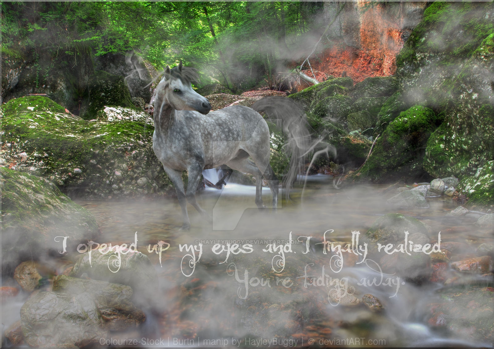
I opened up my eyes and I finally realized, you're fading away.
My idea was a dappled horse that appeared to be fading away into the fog.
My first manipulation in about 4 months.
I'm not really sure that I've improved any, since I haven't had any practice.
Please give me your comments and help me improve? (Smile)")
Time Taken: About one hour
Program used: Adobe Photoshop Elements 10
Horse: colourize-stock.deviantart.com…
Background: burtn.deviantart.com/art/Canyo…
My idea was a dappled horse that appeared to be fading away into the fog.
My first manipulation in about 4 months.
I'm not really sure that I've improved any, since I haven't had any practice.
Please give me your comments and help me improve?
Time Taken: About one hour
Program used: Adobe Photoshop Elements 10
Horse: colourize-stock.deviantart.com…
Background: burtn.deviantart.com/art/Canyo…
Image size
3517x2481px 13.56 MB
© 2013 - 2024 HayleyBuggy
Comments1
Join the community to add your comment. Already a deviant? Log In
ok, on the negative side:
its all very confusing to the eyes -especially with the text there. You hardly notice the horse which probably should have been the most important thing of them all. Please refrain from using DA's watermark when you have your own as well. it also only makes everything confusing.
Add some other colored shading like green, and some yellow/orange-ish highlights or it wont blend in.
The fog is a bit too thick and confusing, but eh, it doesnt mean too much really
positive side:
It is nicely put together if you remove the watermark and text.
I see where you wanted to go with your idea, and it is a beautiful concept
Overall comments:
i wish the horse was the thing your eyes got drawn to. Stronger colors from it -or as said, highlights which blends in ok- would just be perfect!
awesome composition apart from text, and overall a beautiful image.
hope you could use my comment for anything!
also, if you want me to, i could show you what i mean with shading and highlights.